Volt
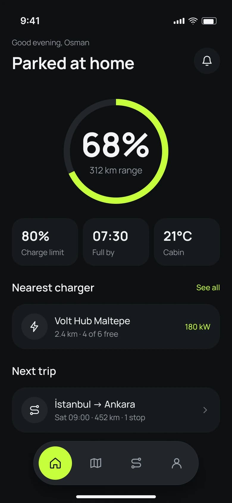
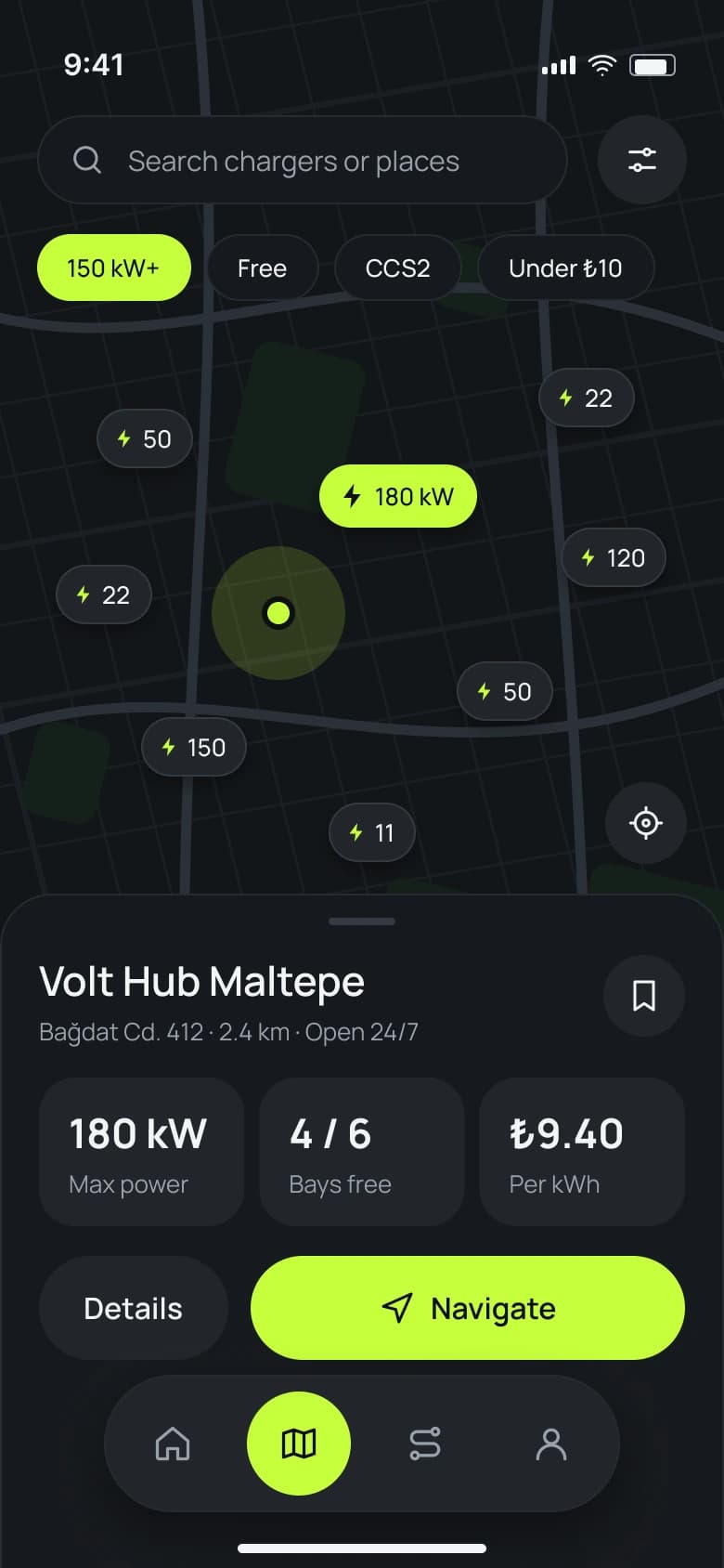
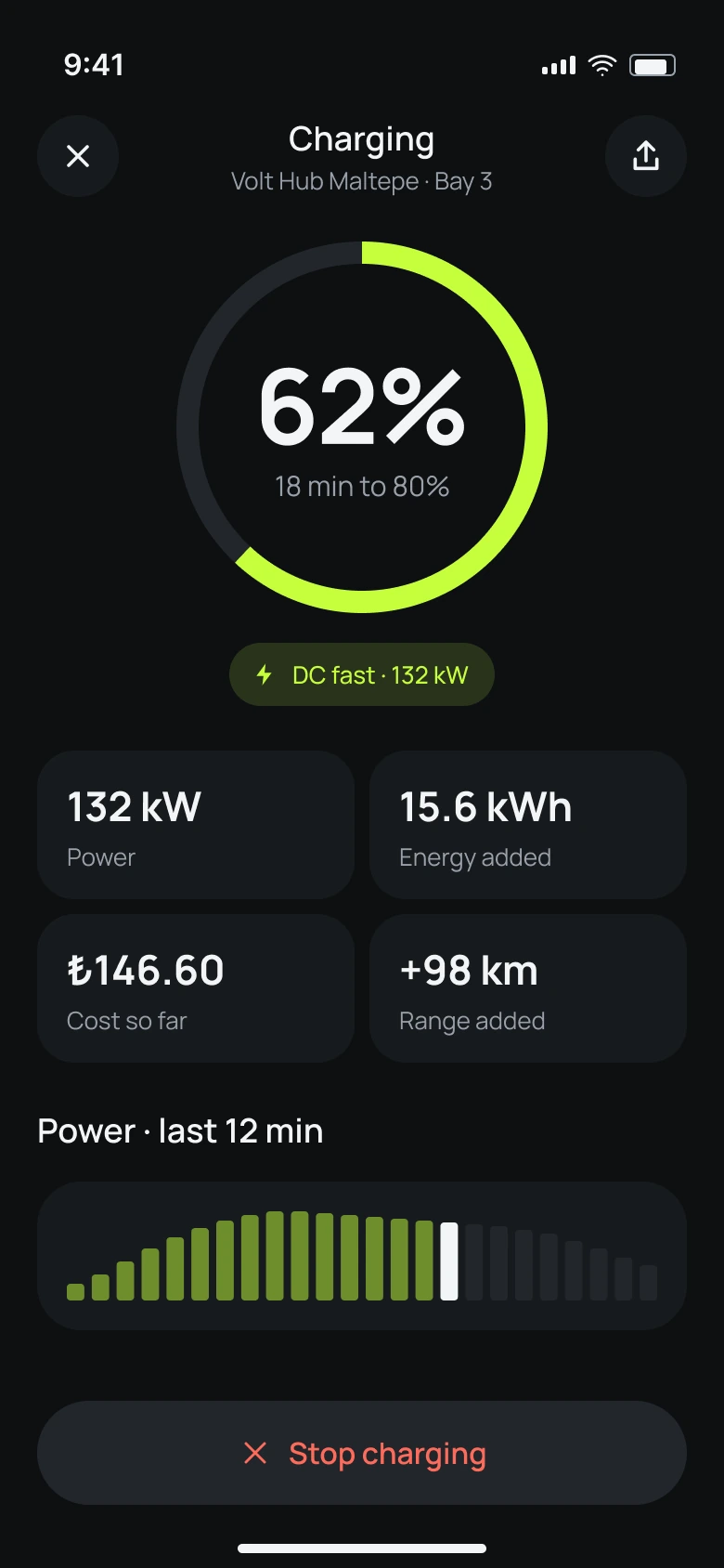
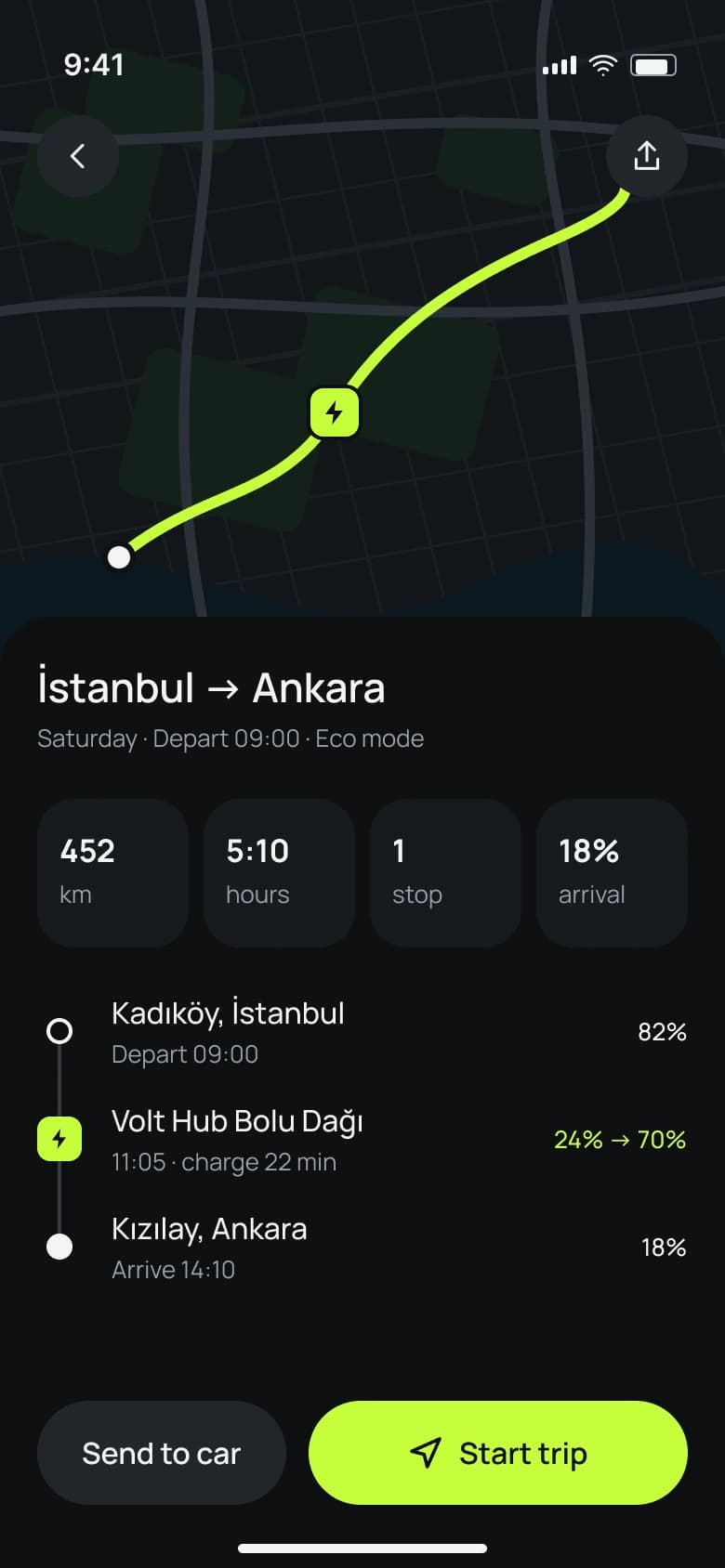
An EV charging and trip planning app. Find a fast charger, plan long drives with stops built in and follow every session live, in a calm dark interface made for the road.
- Role
- UX & UI design
- Year
- 2026
- Platform
- iOS
01
The idea
Charging an electric car still means juggling apps: one to find a charger, one to pay, another to plan a road trip. Range anxiety comes from not knowing, so I wanted one calm app that answers three questions at a glance: how far can I go, where can I charge and how long will it take.
02
What I did
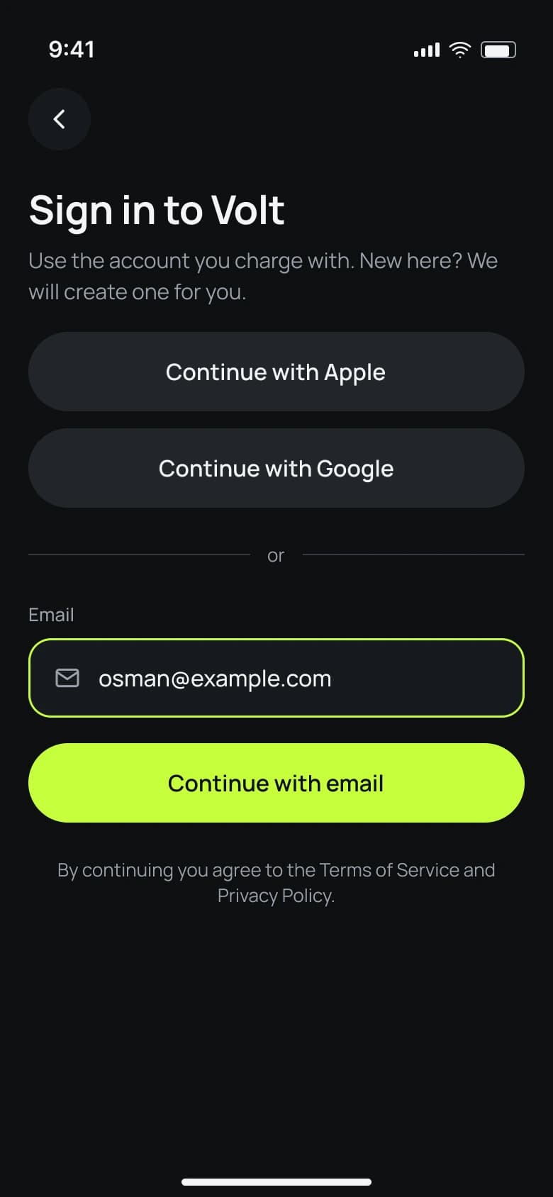
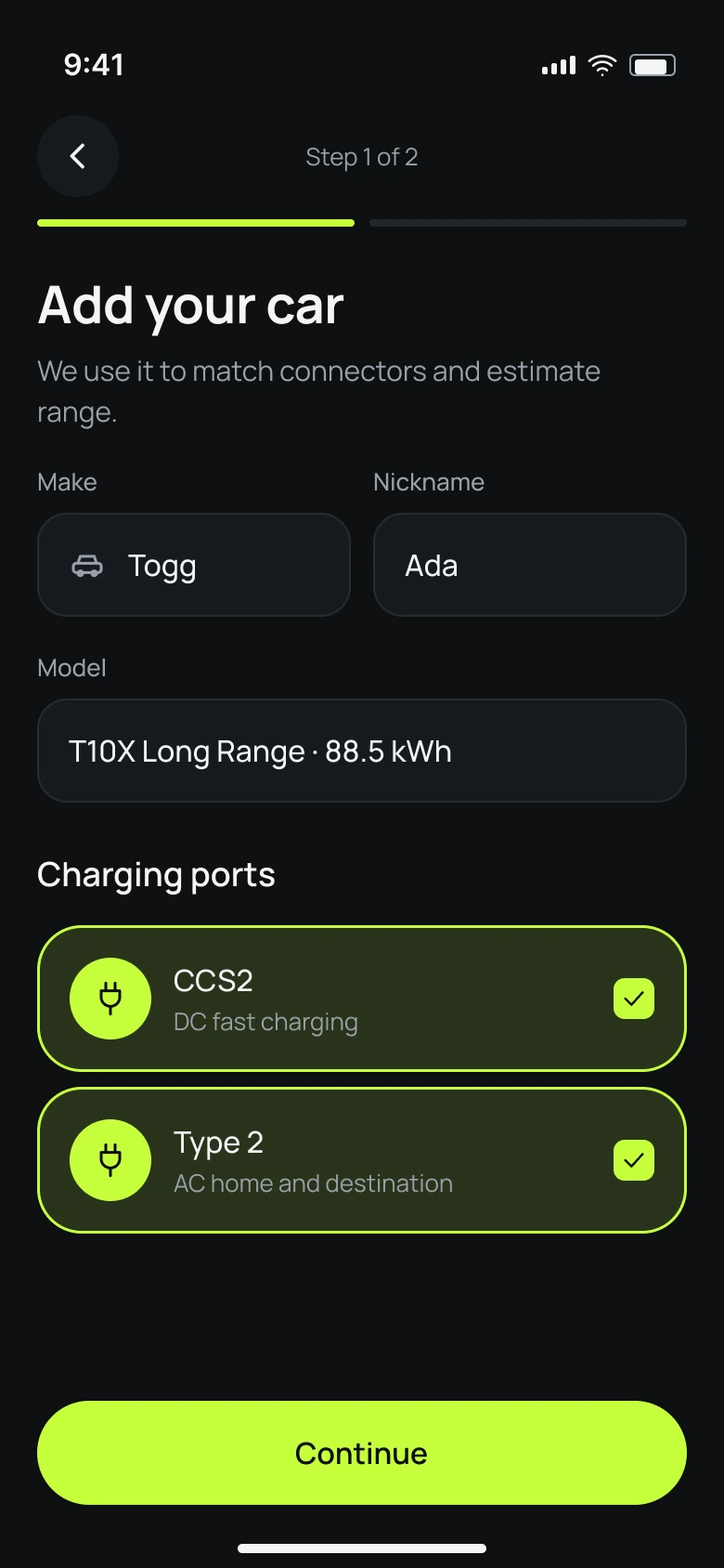
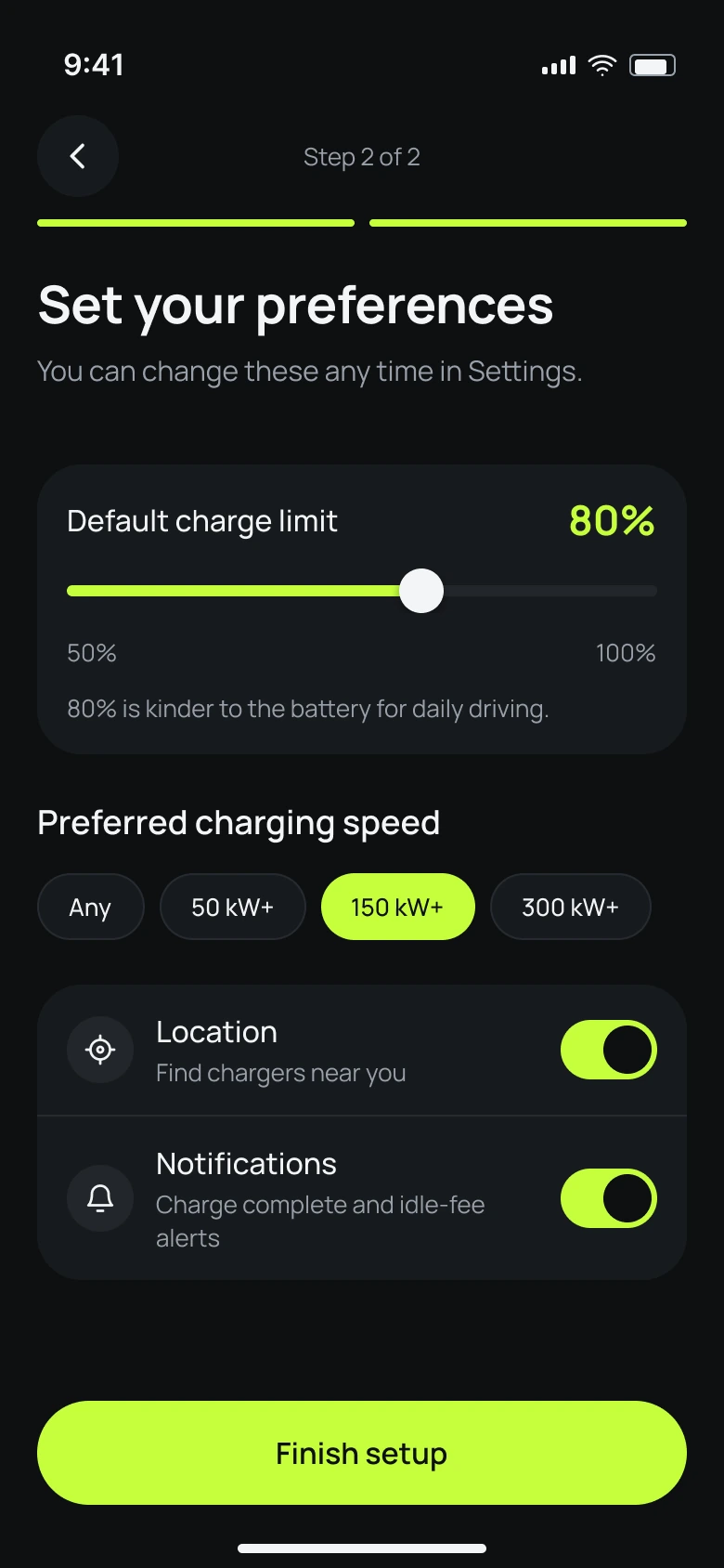
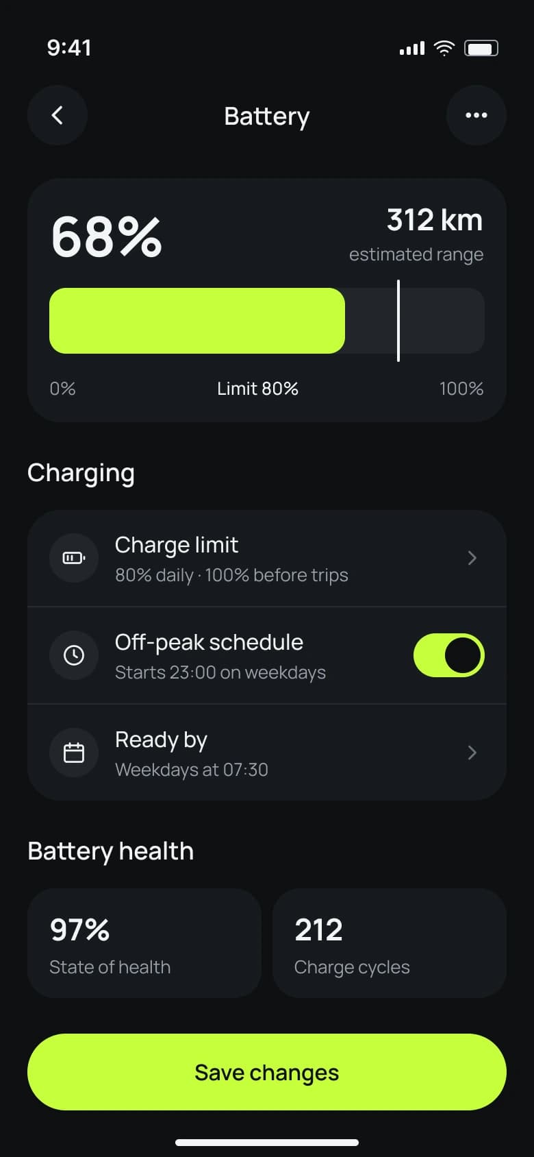
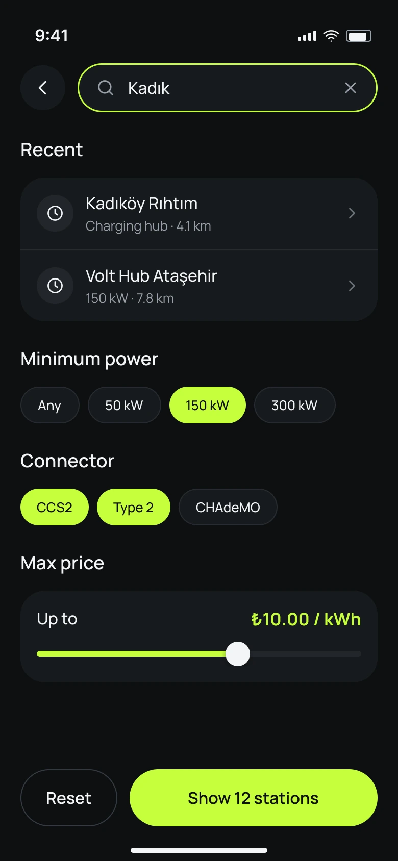
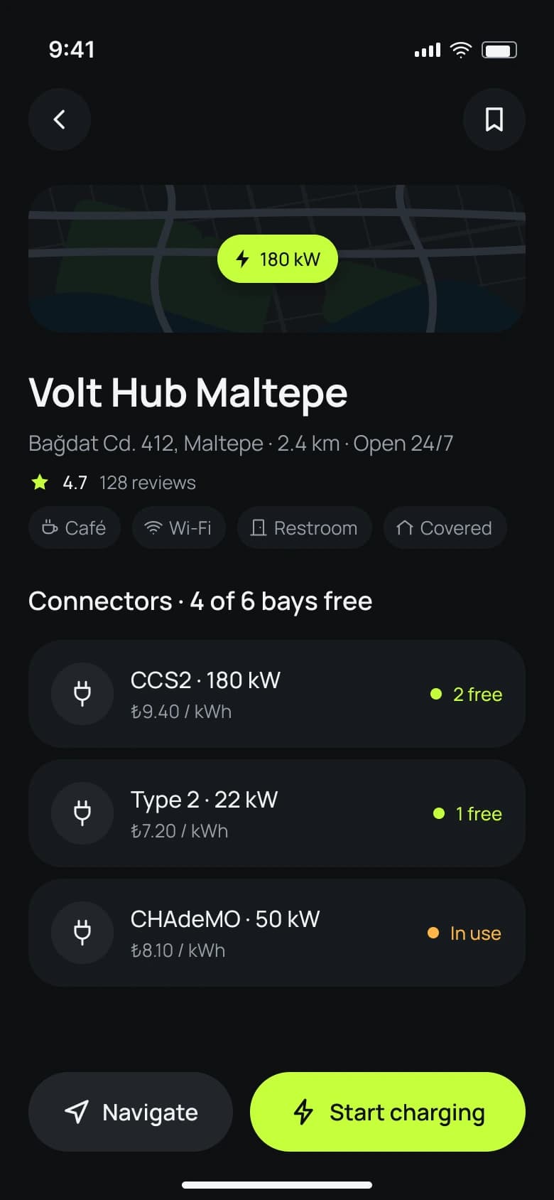
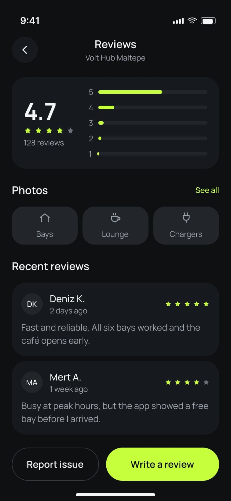
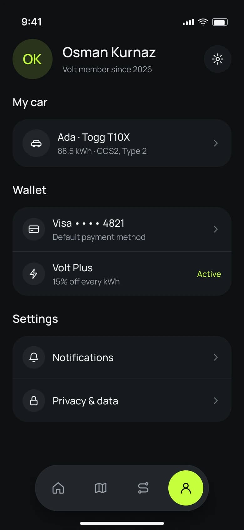
I designed the product end to end: research, six visual concepts, a token-based design system with reusable components and 43 icons, and 20 screens covering onboarding, home, map and station search, the full charging flow with a lock-screen Live Activity, trip planning with charging stops, navigation, insights and wallet.
03
Research & inspiration
I studied Tesla, Rivian, Polestar, My BMW, Shell Recharge and Setel on Mobbin, plus EV concepts on Pinterest. What worked: a bottom sheet for the selected station, power shown on map pins, stops as a timeline and a clear target with time left while charging. Common gaps: unclear availability, prices hidden until plug-in and no single place for long trips.
04
Design process
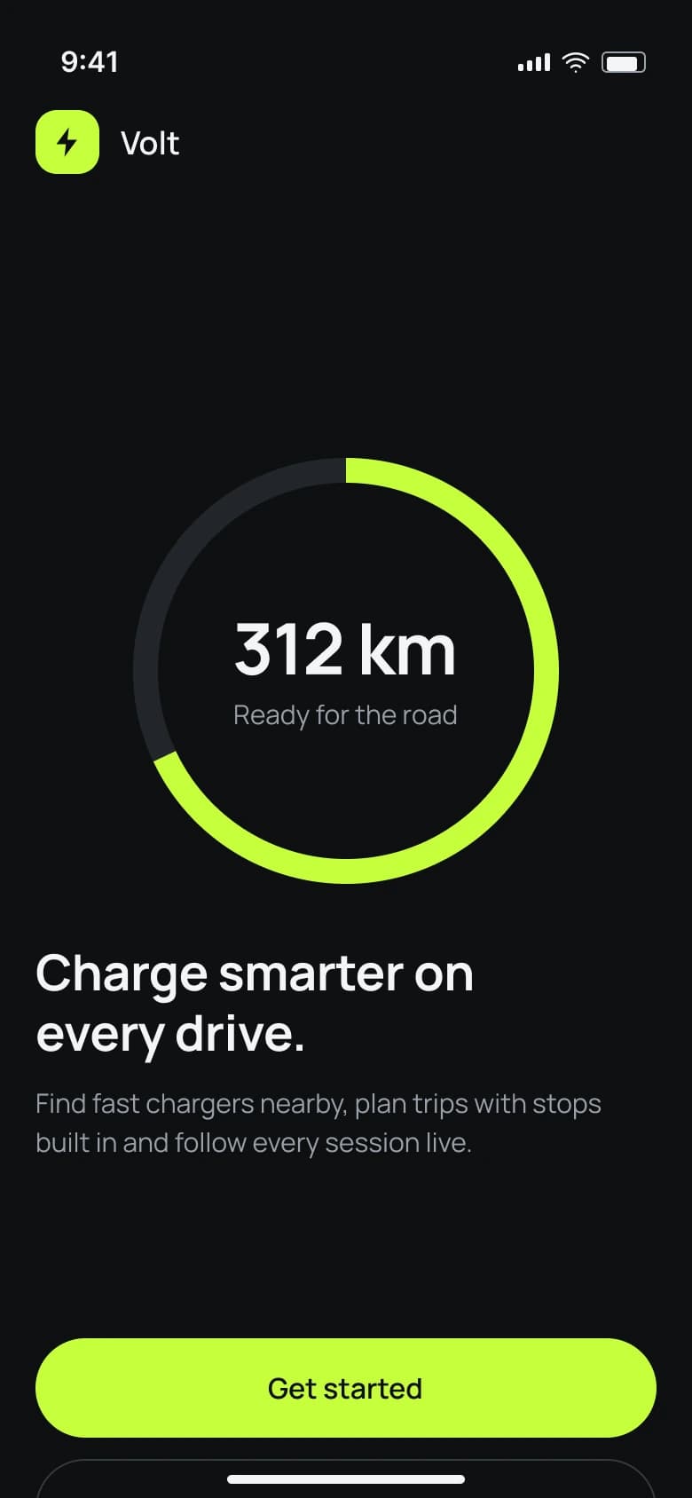
I explored six directions, from Swiss utilitarian to warm editorial, and chose the dark Nocturne direction for night driving and glanceability. One lime accent is reserved for primary actions, active states and live charge data. Every screen is built from shared components (top bar, page header, action bar, dock, list rows) on a 4pt grid with 20pt margins.
Onboarding
Home & discovery

Stations
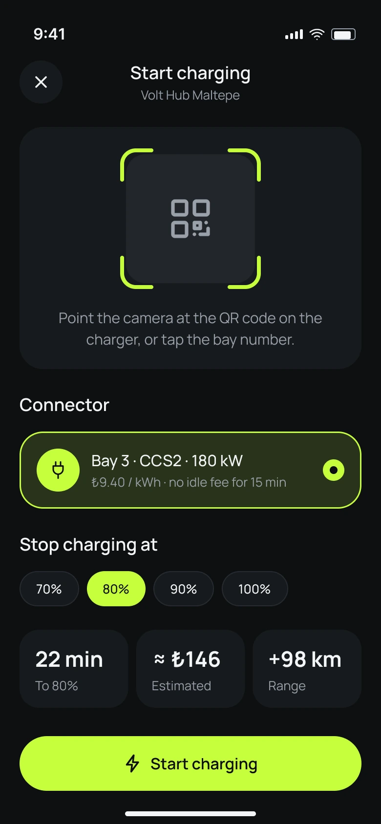
Charging & planning

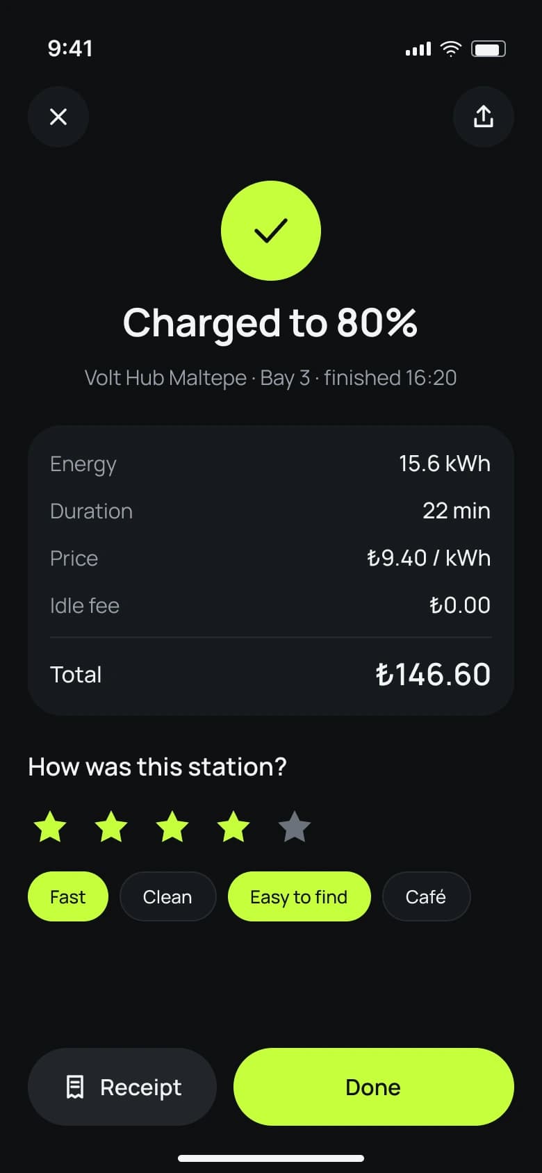

Trips & account
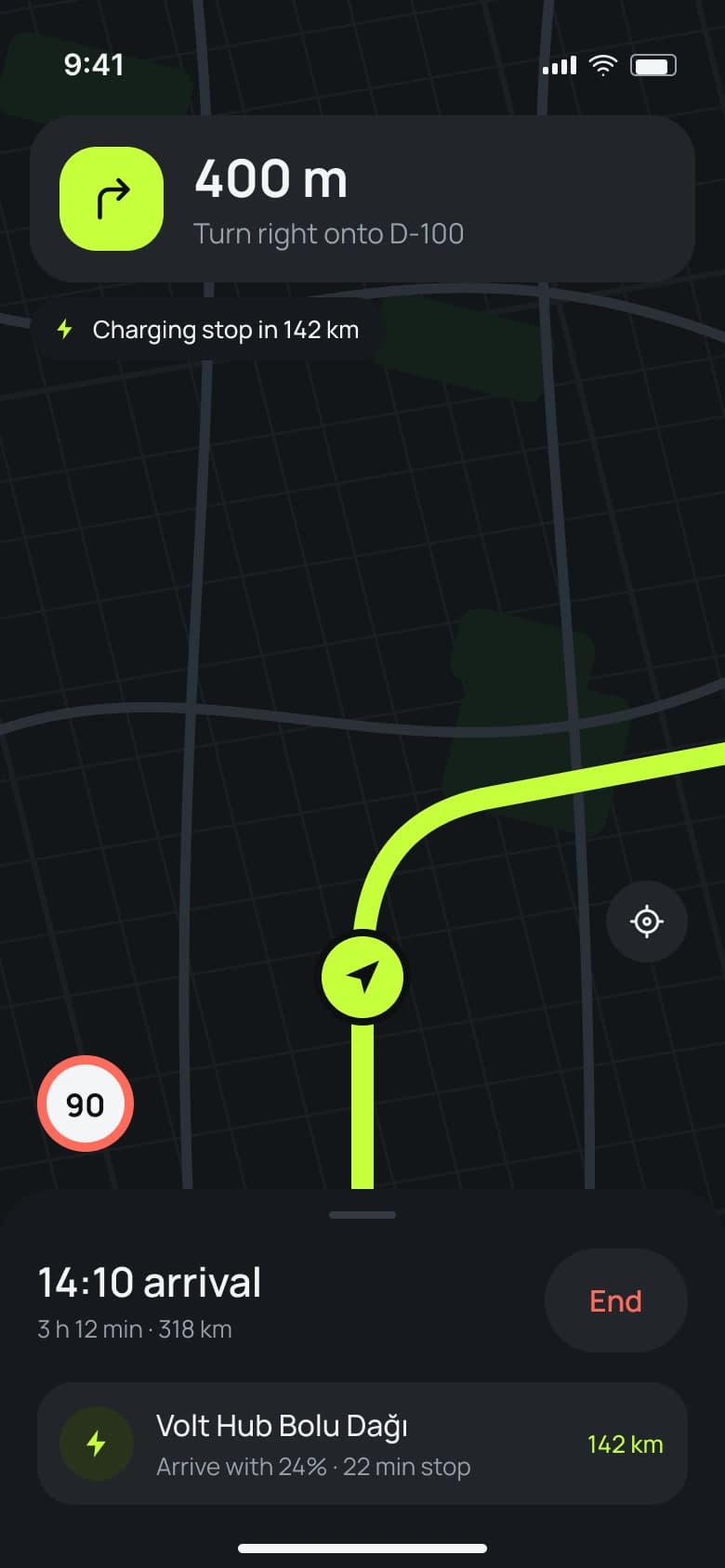
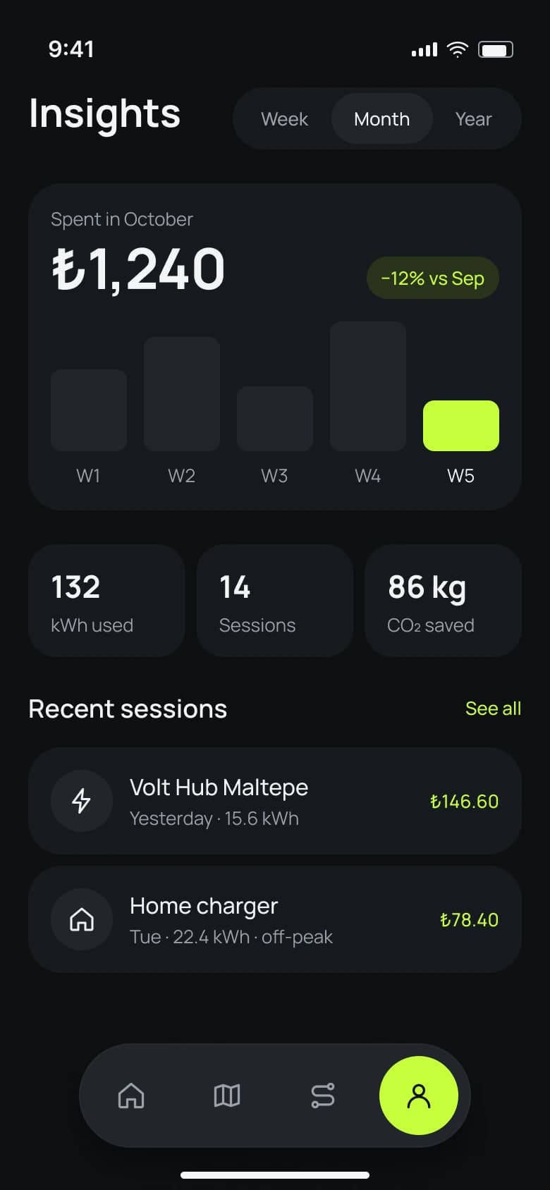
05
What I learned
In a car, hierarchy beats decoration: one key number per screen, one primary action and predictable positions for headers and buttons. Next I would test the trip planner with long-distance drivers and design offline and charger-fault states.