Squared
A shared expenses app for flatmates. Log bills, split them fairly and square up with a single IBAN transfer, without the awkward money talk.
- Role
- UX & UI design
- Year
- 2026
- Platform
- iOS
01
The idea
Living with flatmates means a constant stream of small shared costs: rent, bills and groceries. Popular split apps lock basics like charts and receipt scanning behind paywalls and make it hard to see who owes what. I wanted to design a calmer, more transparent way to keep a home’s money even.
02
What I did
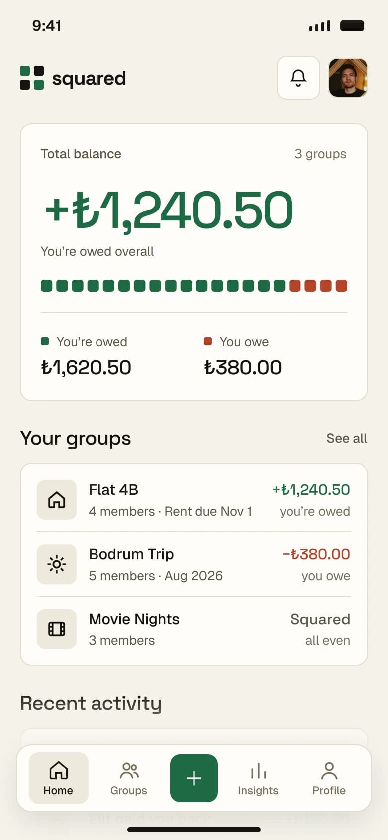
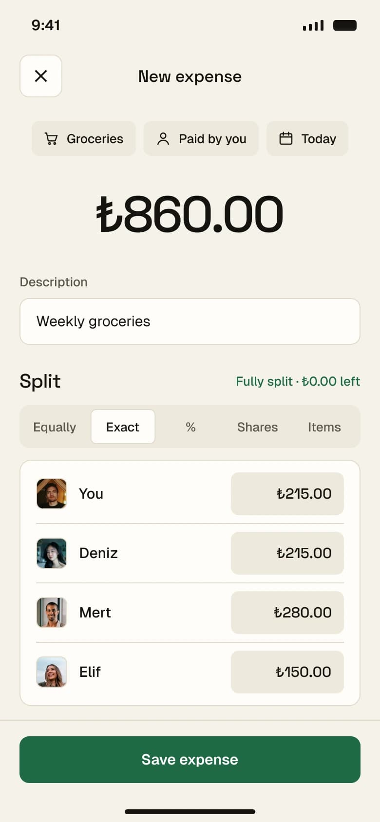
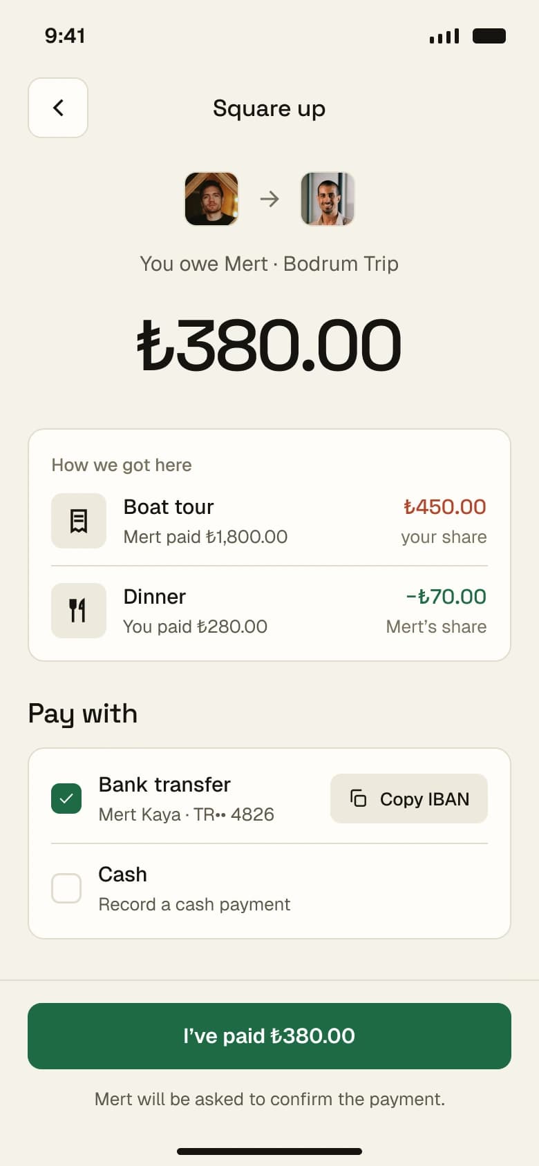
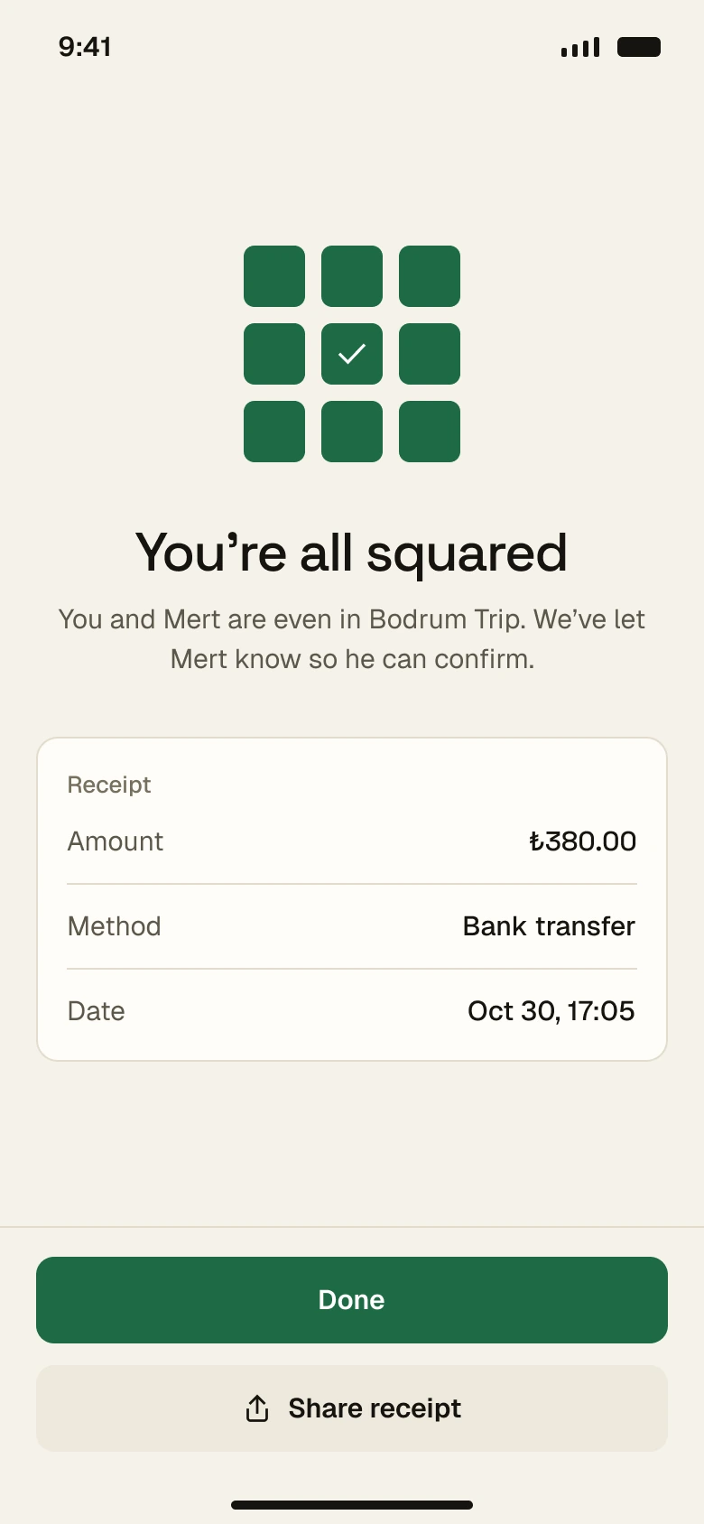
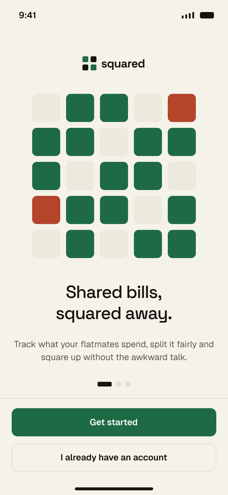
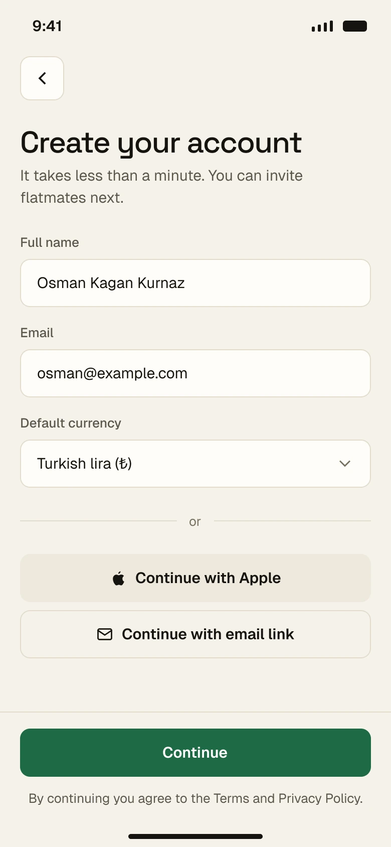
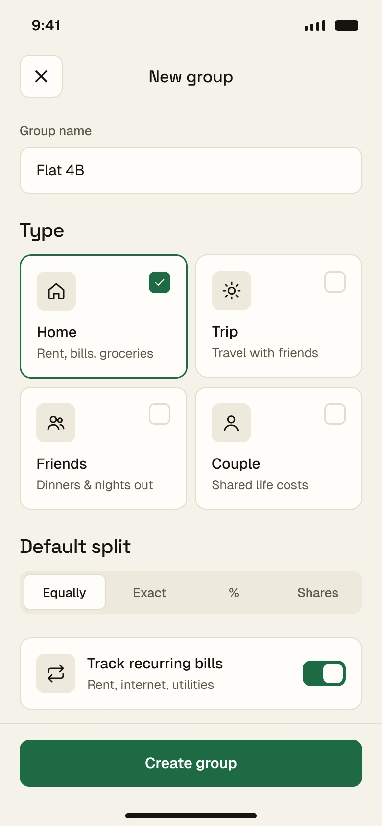
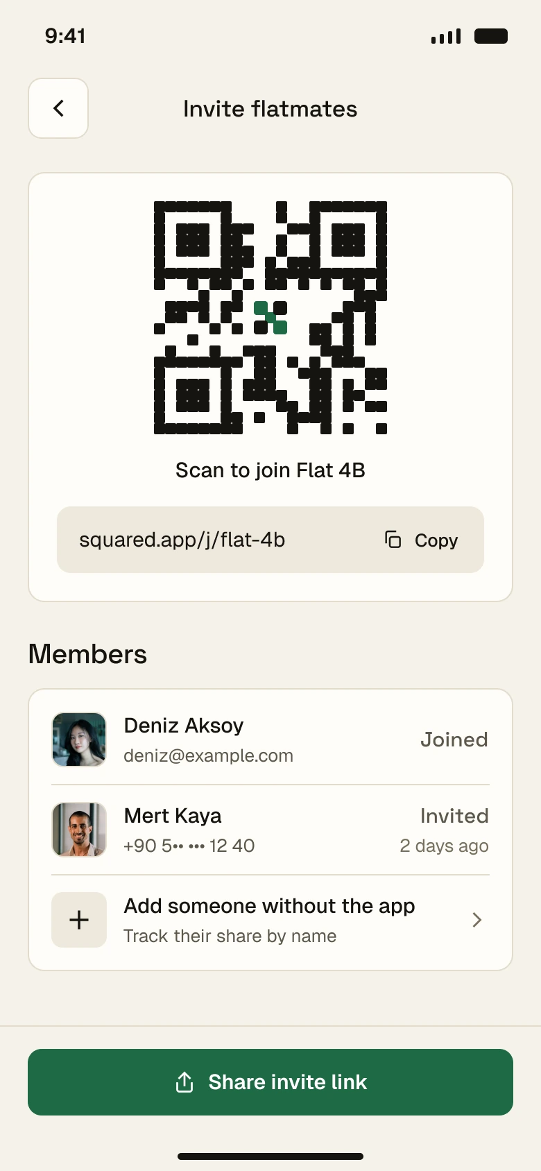
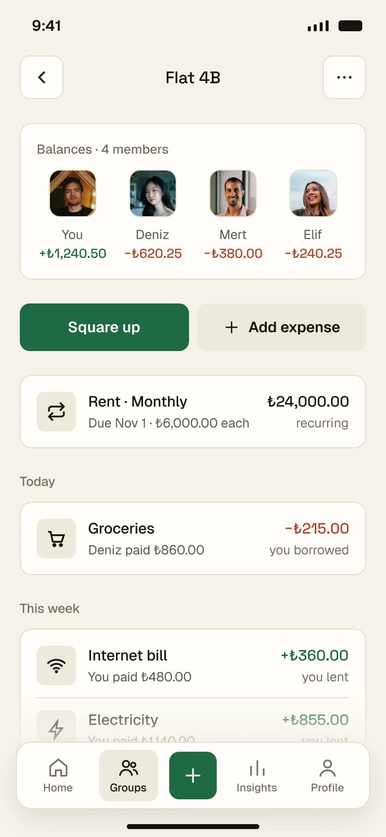
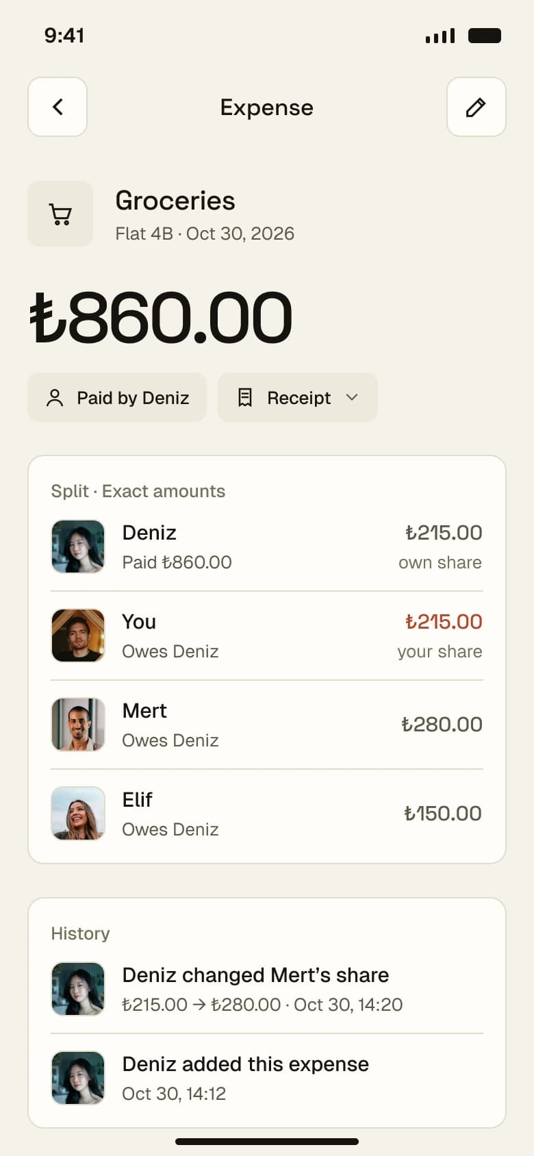
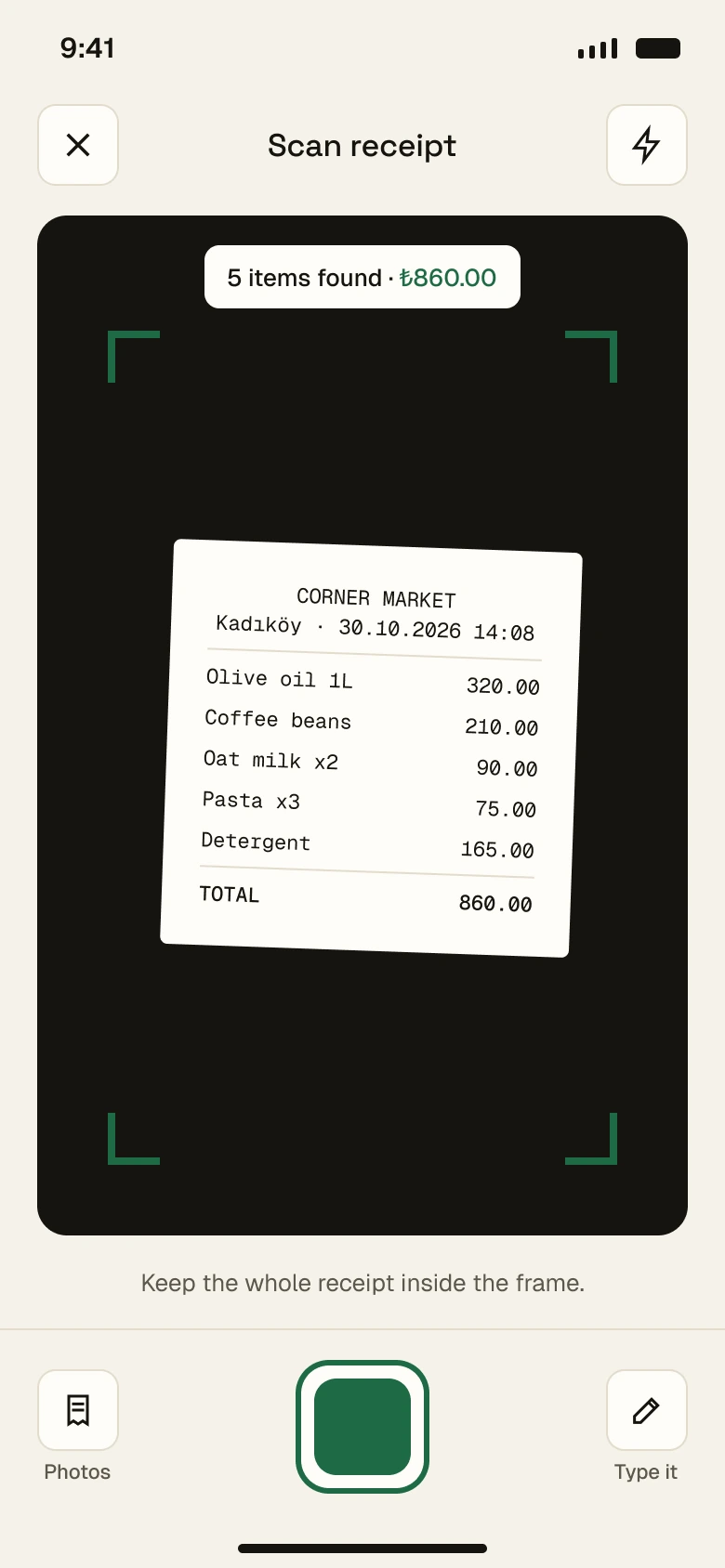
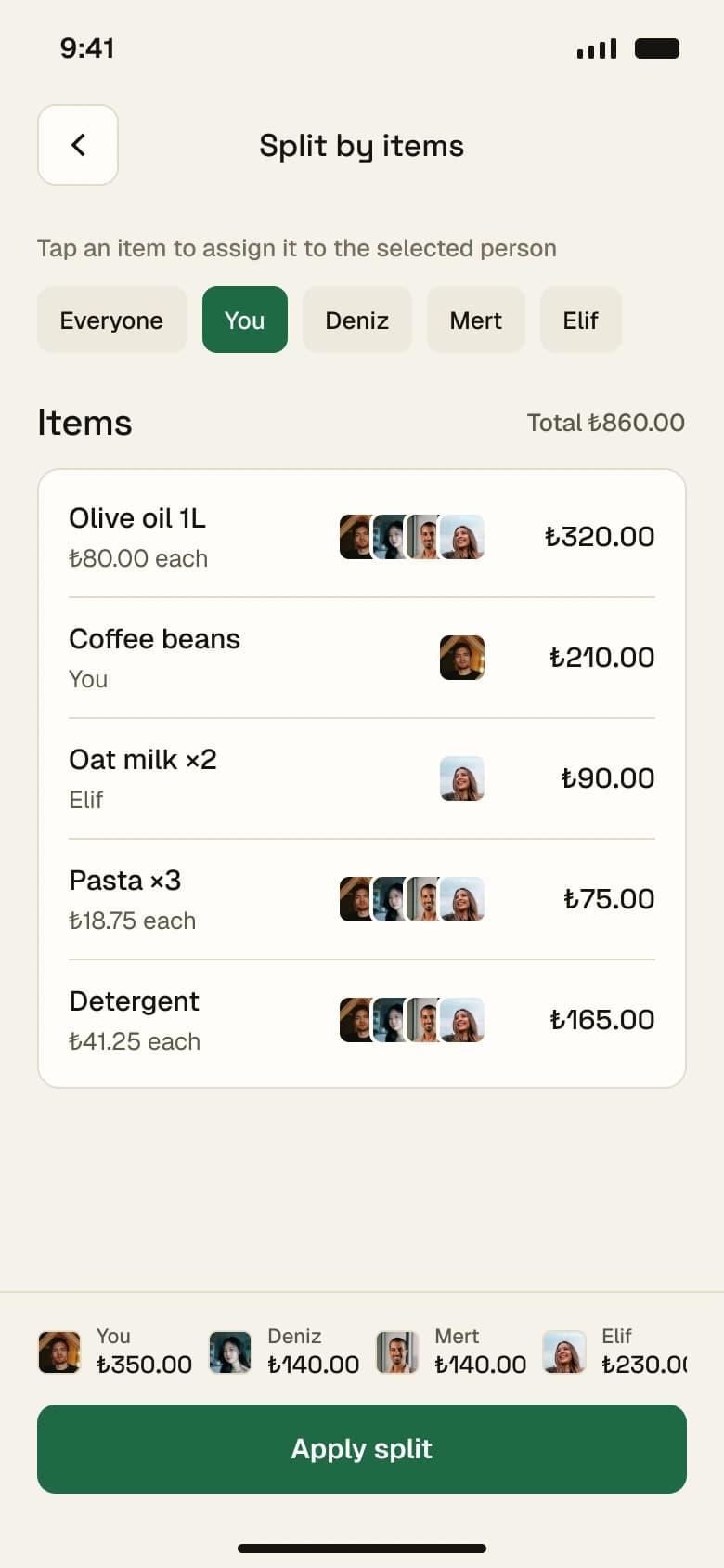
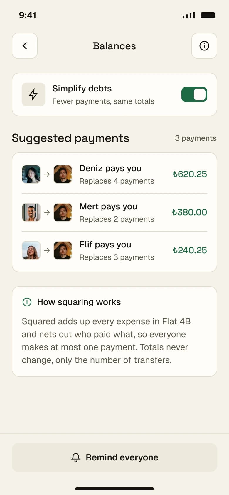
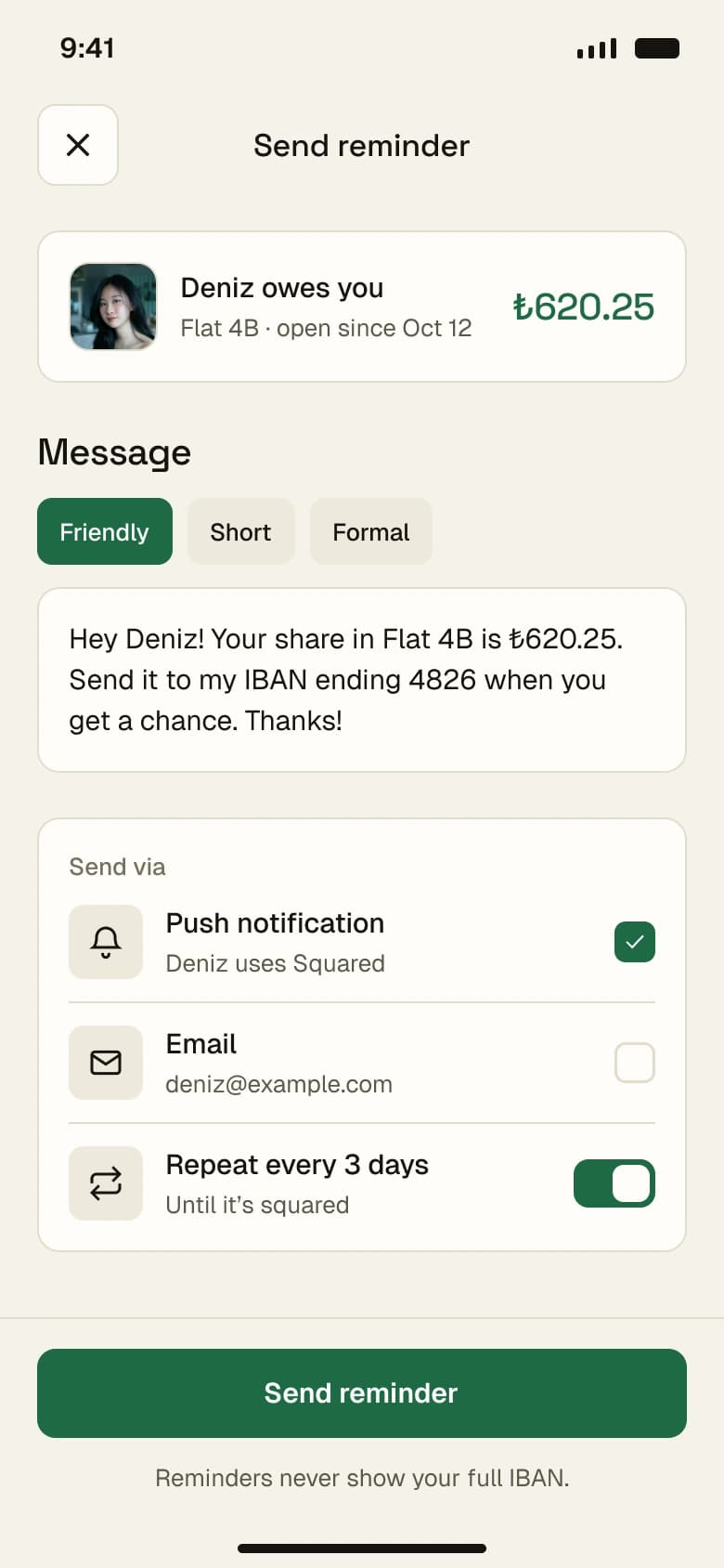
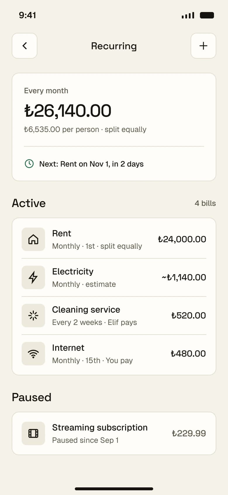
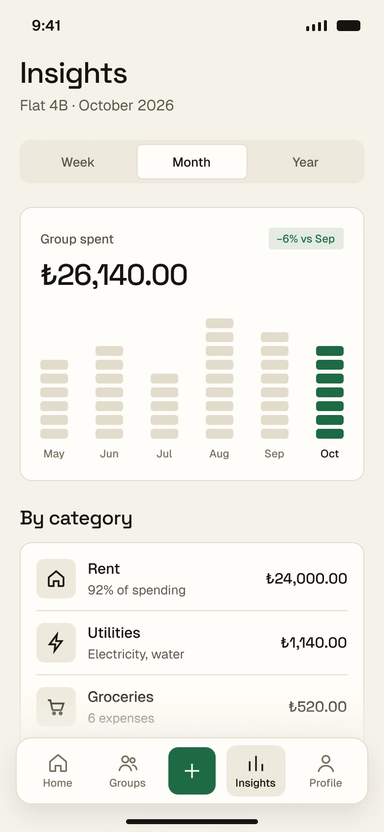
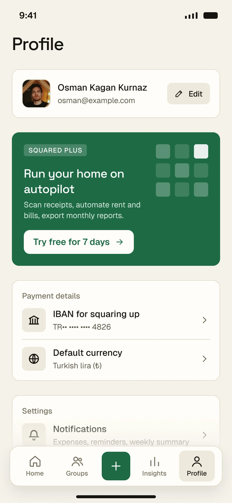
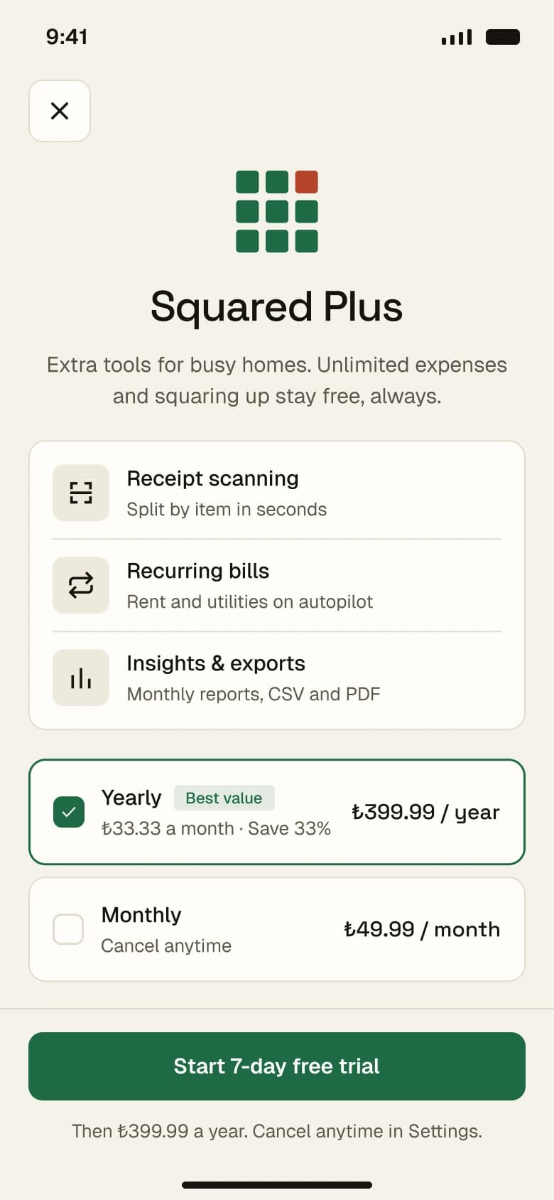
I designed the full experience end to end: competitor research, feature planning, three visual concepts, a design system with tokens and components, and 18 screens covering onboarding, groups, adding and splitting expenses, receipt scanning, balances, squaring up, reminders, insights, recurring bills and a Squared Plus paywall.
03
Research & inspiration
I compared Splitwise, Tricount, Splid and Settle Up, read app reviews and studied flows on Mobbin. Common complaints were daily entry limits, intrusive ads, unclear balances and leaving the app to pay. Squared keeps core features free, explains every balance and turns squaring up via IBAN into a single step.
04
Design process
I explored three directions and refined the editorial “Ledger” concept into a square-based language: warm paper tones, one deep green accent, Space Grotesk numbers and a 4pt spacing grid. A square meter shows what you’re owed at a glance, “Square up” replaces “settle up”, and every screen is built from shared components so cards, rows and headers stay consistent.
Onboarding
Groups & expenses
Receipts & splitting
Squaring up & managing
Profile & Squared Plus
05
What I learned
Money between friends is as much about feelings as numbers. Clear explanations, gentle reminder tones and two-step payment confirmation build more trust than extra features. Next I would test the split flow with real flatmates and design empty and offline states.