Airbnb Redesign
An unofficial concept redesign of the Airbnb mobile app in Turkish, focused on a clearer search flow, richer stay details and a friendlier sign-up.
- Role
- UX & UI design
- Year
- 2025
- Platform
- iOS
01
The idea
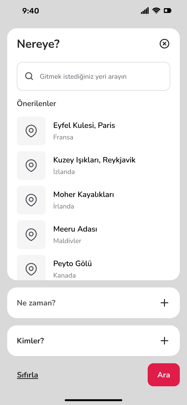
I wanted to rethink how people search for and compare stays on mobile. This unofficial concept explores a calmer interface, a step-by-step search and stay pages that answer the most common questions at a glance.
02
What I did
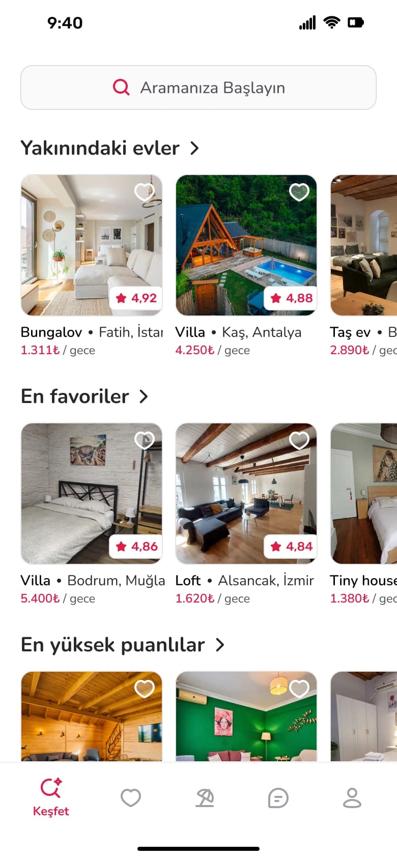
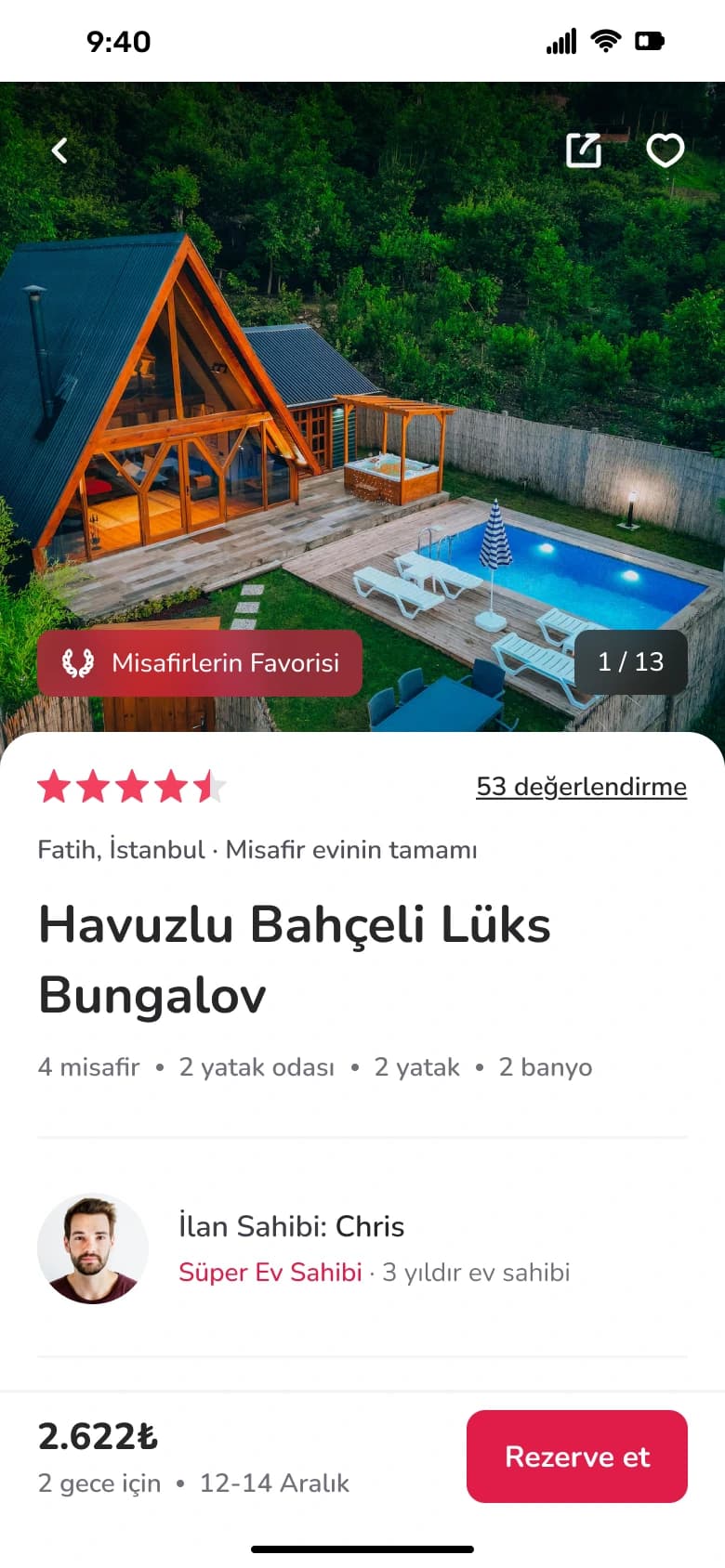
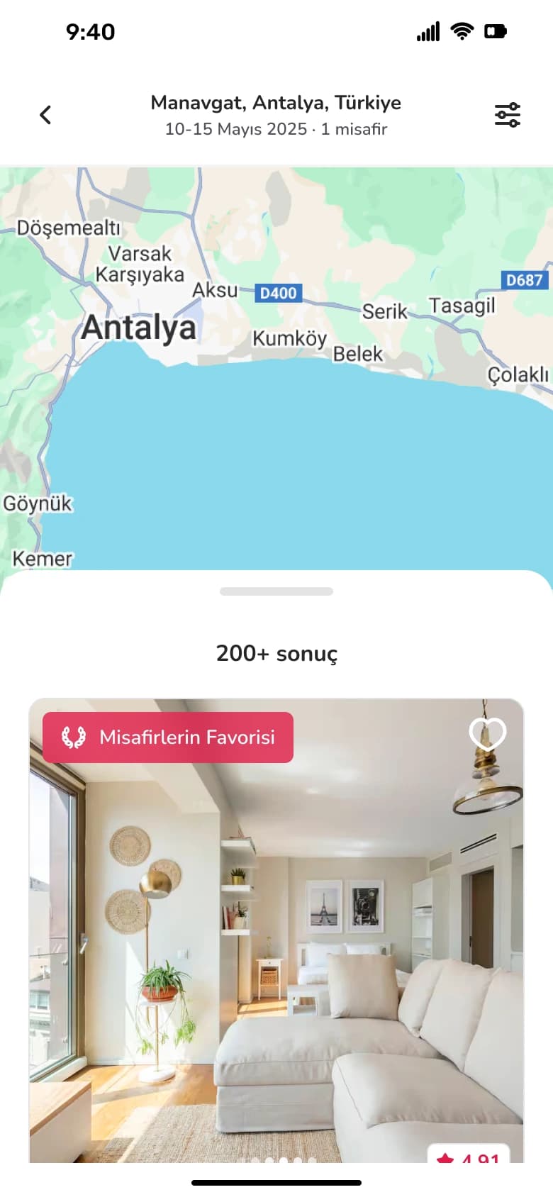
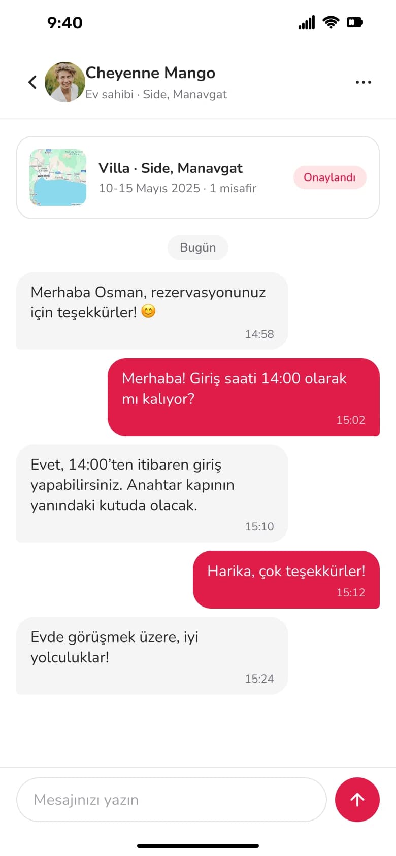
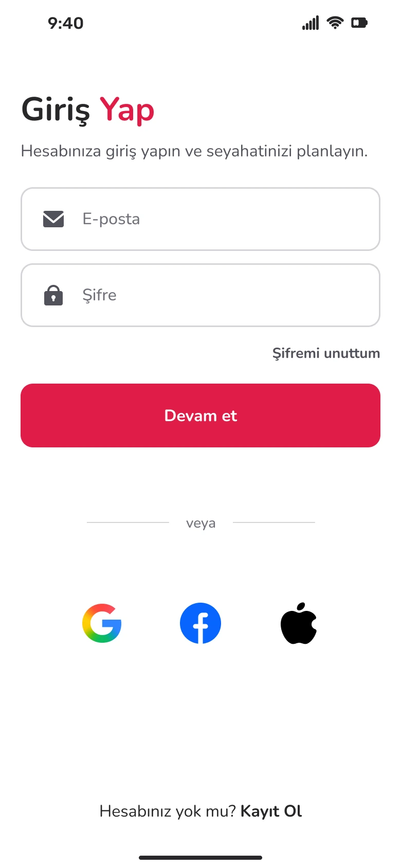
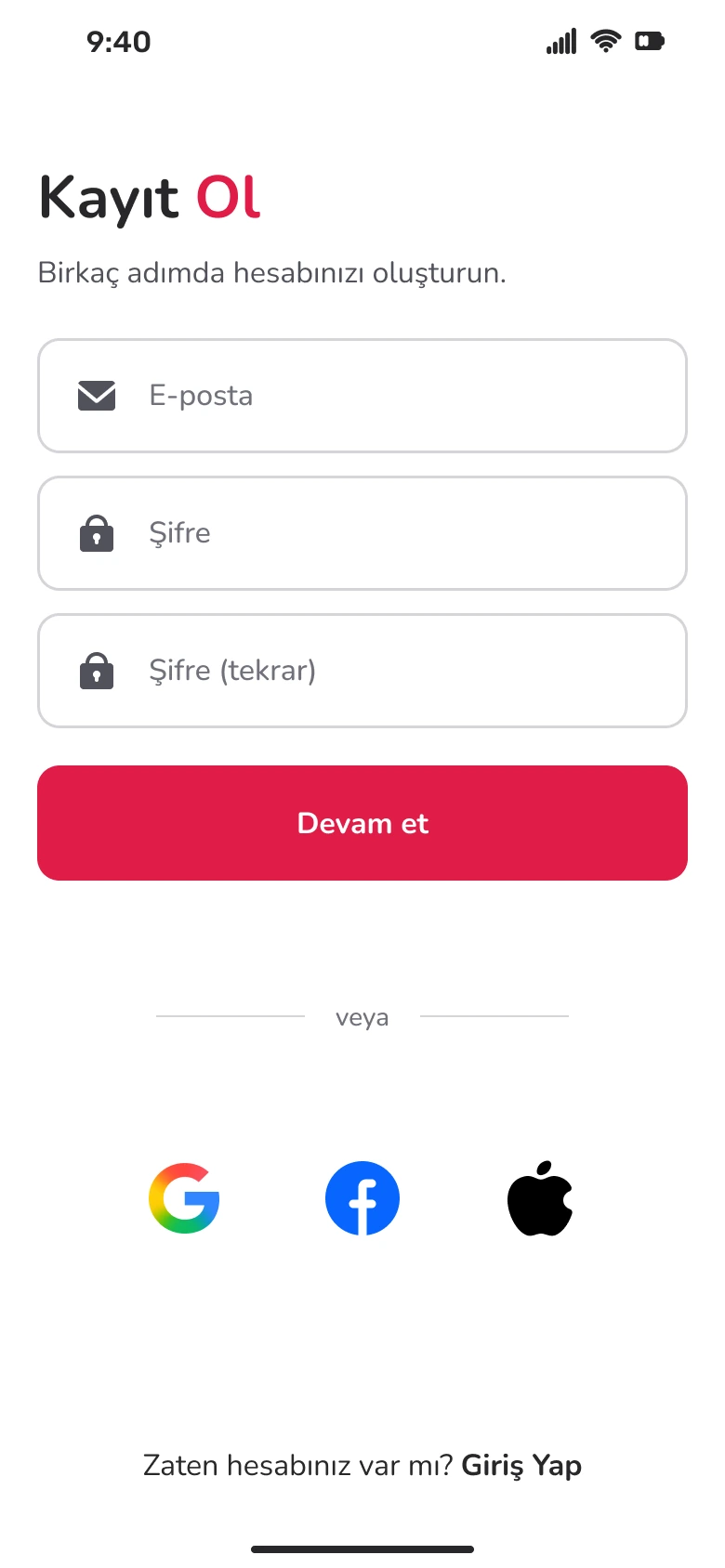
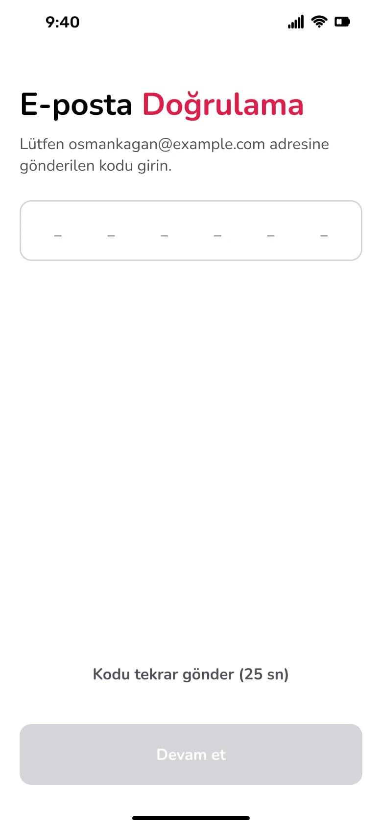
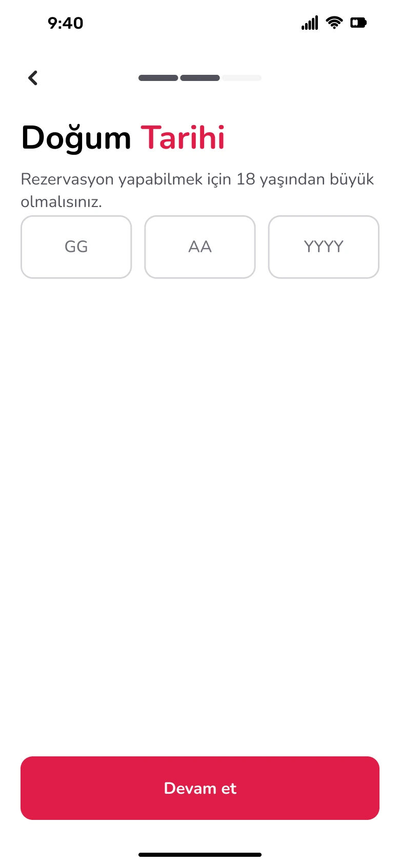
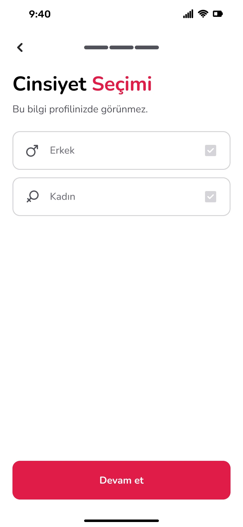
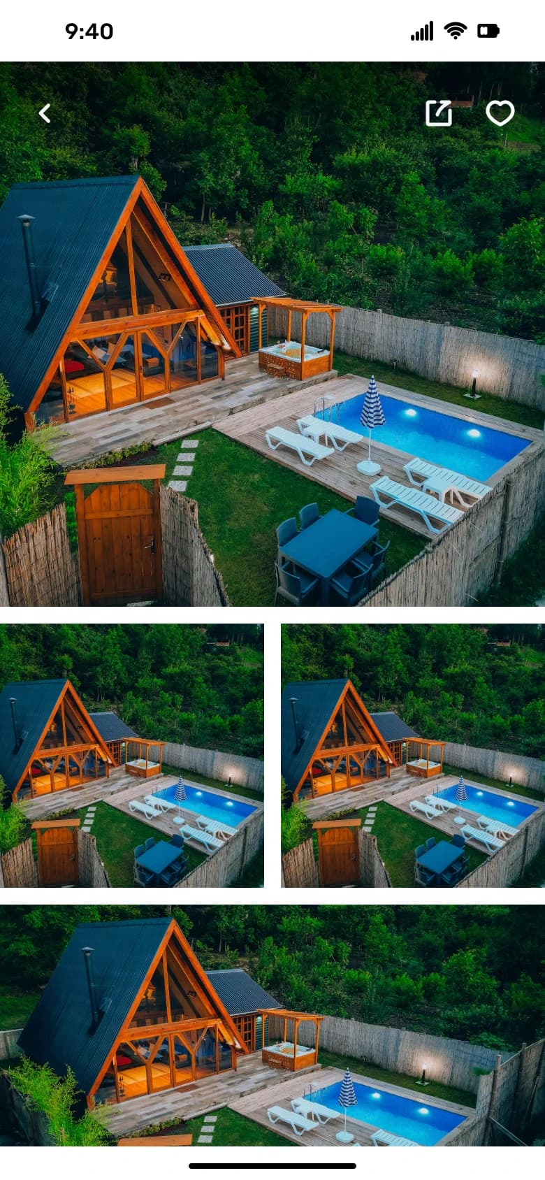
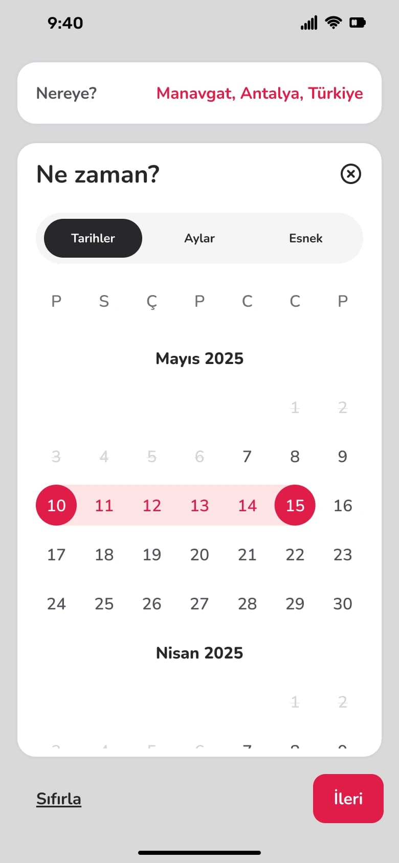
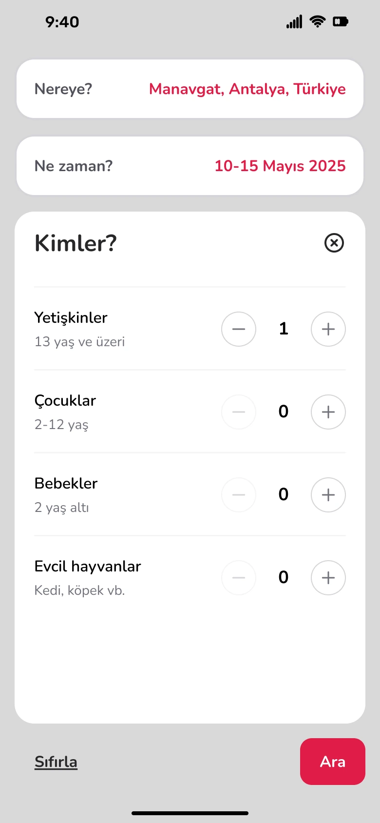
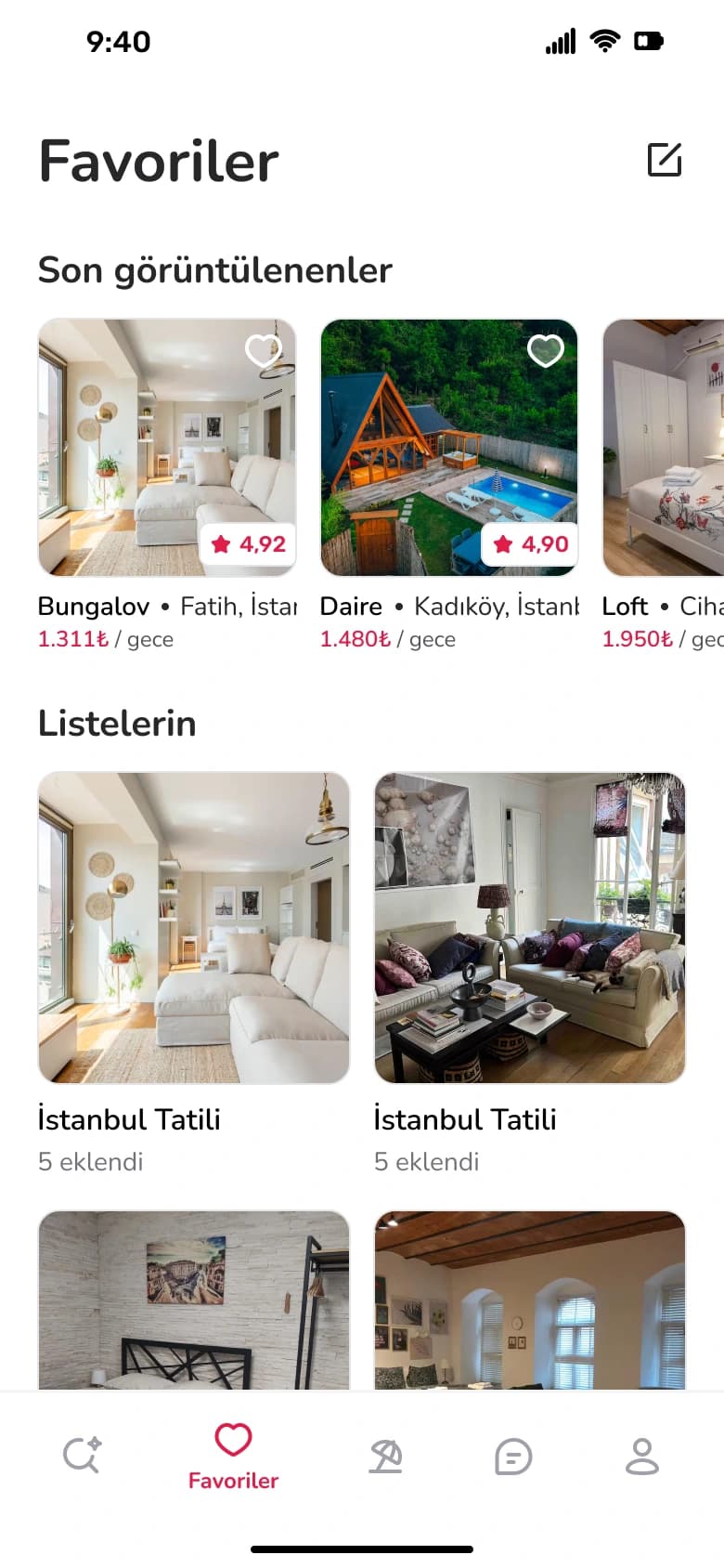
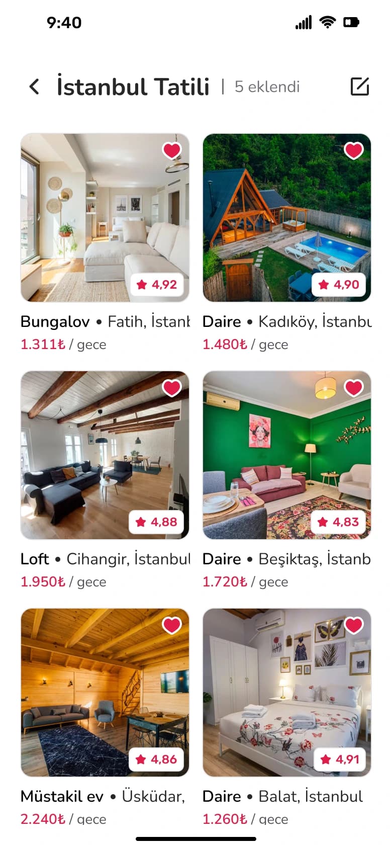
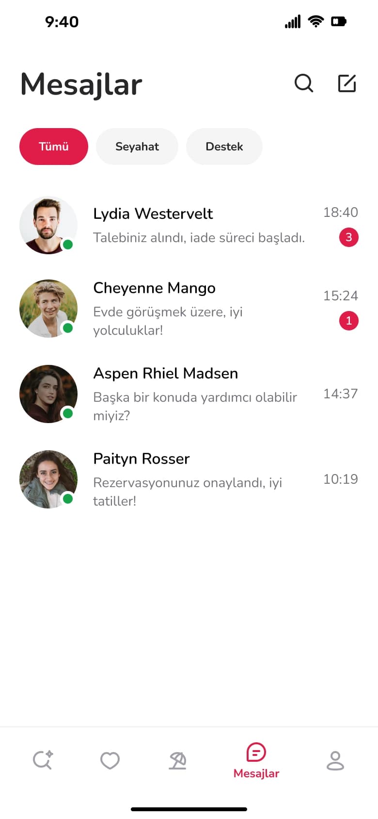
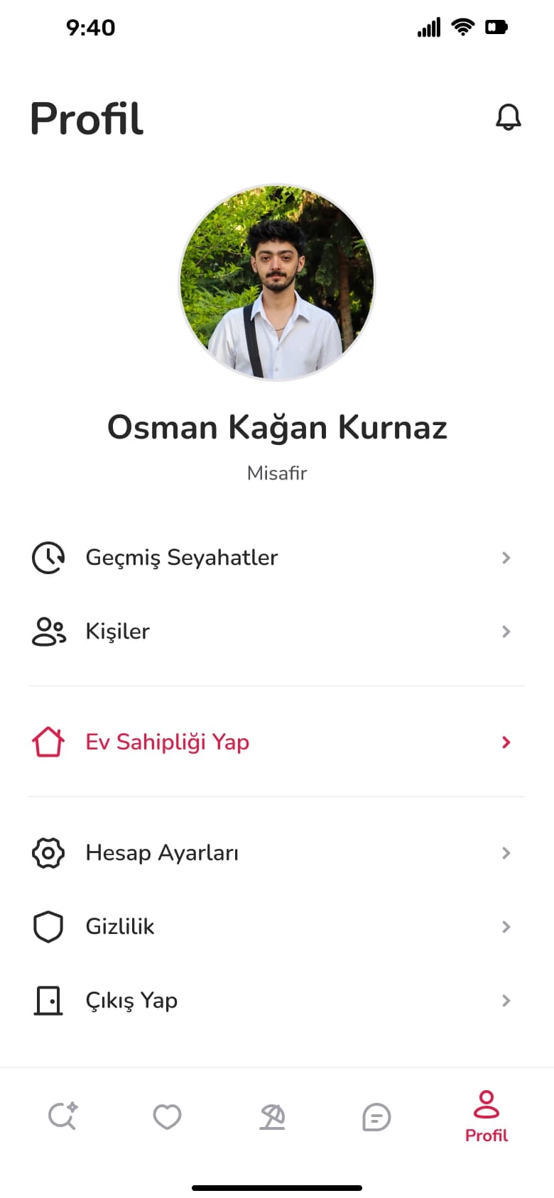
I redesigned the core journey: email sign-up with verification and profile steps, the discover feed, stay details with photos, amenities, house rules and reviews, the host profile, a guided where-when-who search, favorites and wish lists, trips, messages and the profile area.
03
Research & inspiration
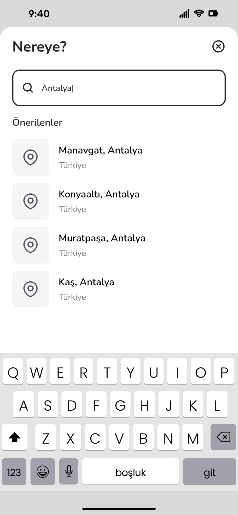
I mapped the current booking journey and listed the moments where it felt crowded, such as long detail pages and multi-field search. This led to a search split into three clear steps and detail pages organised into short, scannable sections.
04
Design process
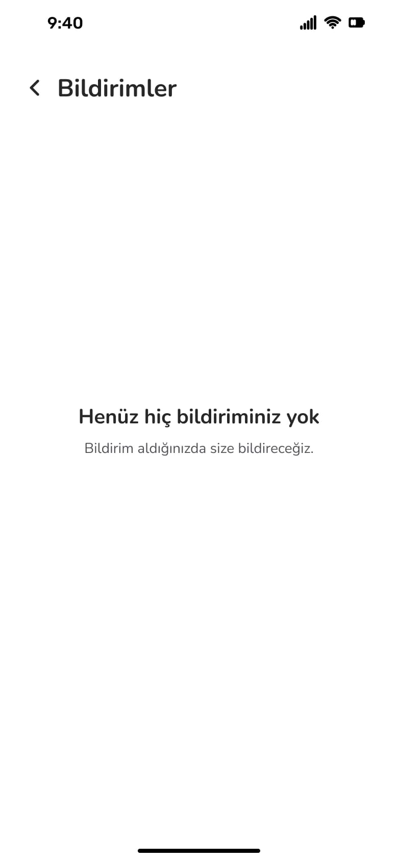
A light interface with a single coral accent highlights key actions and prices. Shared components for listing cards, chips, inputs and bottom sheets keep the many screens consistent, and every flow includes its empty, typing and keyboard states.
Sign up & log in

Profile details


Discover & stay details

Search a trip
Results, favorites & trips
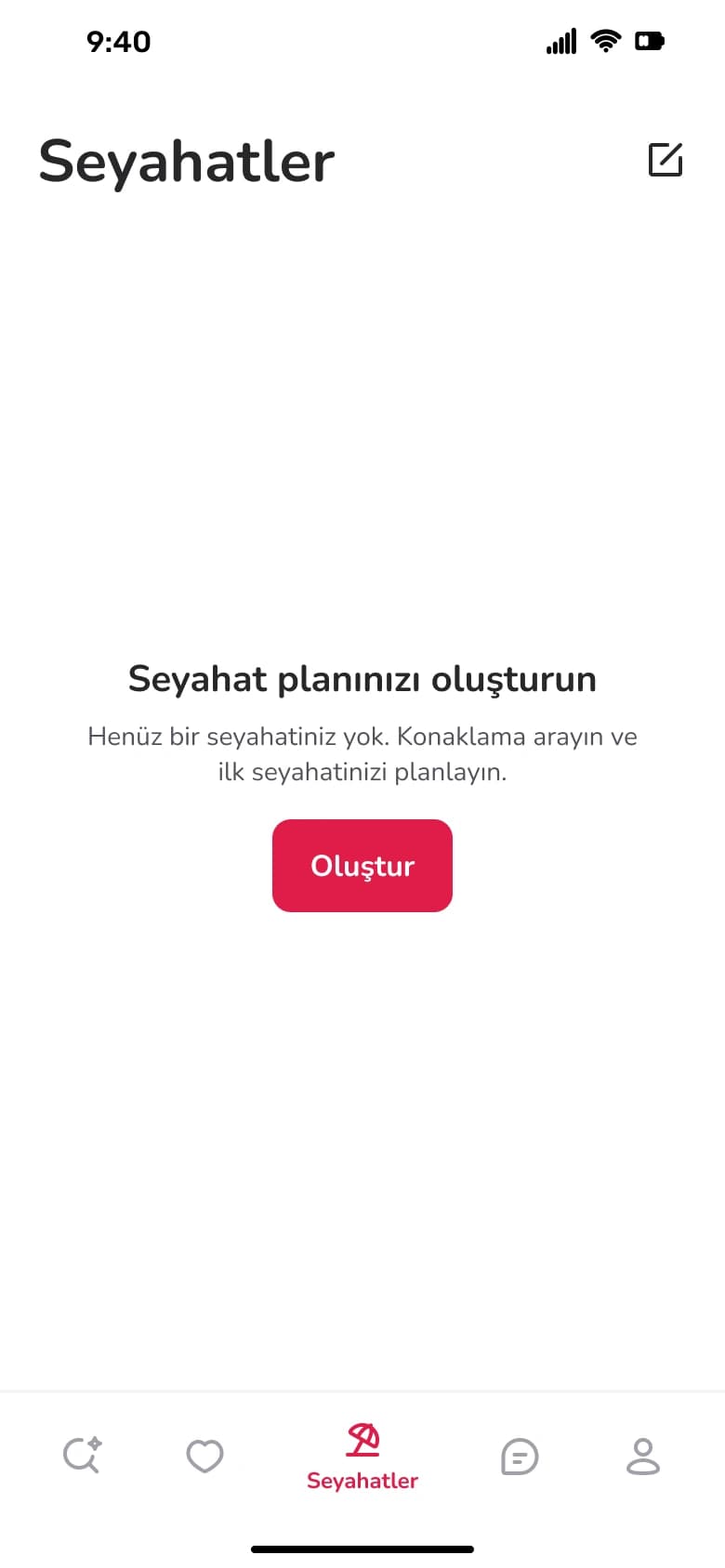
Messages & profile
05
What I learned
Redesigning a well-known product taught me to respect existing habits while improving the details. Next I would test the new search flow with users and design the host experience.